Components Overview
Components are the fundamental building blocks of a flow in Robility Flow. Much like classes in a traditional software application, each component is tailored to perform a specific task or enable a particular integration. They handle input, execute logic, and produce output—allowing you to construct sophisticated workflows with modular, reusable elements.
Tips for Efficient Workflow Navigation
Robility Flow offers keyboard shortcuts to improve your efficiency when working within the Workspace.
To view available shortcuts:
1. Click your profile icon in the header.
2. Select Settings.
3. Navigate to the Shortcuts
Adding Components to a Flow
To build your flow, you’ll start by adding components from the Components menu to the Workspace.
Steps:
1. Open the Components menu on the left panel.
2. Drag a component from the menu into the Workspace.
Component Categories:
The Components menu is organized by type and may contain hidden items based on status:
1. Beta Components:
Core Robility components organized by functionality—such as Inputs, Data, or Models. These are under active development and may not be suitable for production use.
2. Legacy Components:
Deprecated components that are no longer supported. Hidden by default. To view, go to Component Settings and enable legacy components.
3. Bundle Components:
Integration-specific components grouped by external provider or service.
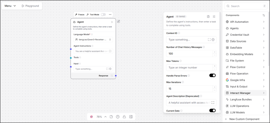
Component Inspection Panel
A Component Inspection Panel is a dedicated UI panel that provides complete visibility into the properties and configuration of a selected component. When you select a component in the workspace, the inspection panel automatically appears on the right side of the screen, displaying all of the component’s parameters, including hidden or advanced ones. The inspection panel displays all parameters of the selected component.
How It Works
1. Select a Component – Click on any component in the workspace.
2. Panel Appears – The inspection panel instantly appears on the right side of the screen.
3. View Parameters – All parameters of the selected component are listed in the panel.
4. Edit or Inspect – You can read, modify, or configure the component’s settings directly from the panel.
Key
1. The inspection panel is located on the right side of the screen.
2. It is context-sensitive; it only appears when a component is selected.
Configuring a Component
Once a component is added to your flow, it must be configured to function correctly and connected to other components in the workflow.
Key Configuration Elements:
a. Inputs & Outputs: Define what data the component accepts and produces.
b. Parameters: Core settings that influence the component’s behavior.
c. Controls: Optional runtime flags, toggles, or switches depending on the component type.
By default, only the required and commonly used options are visible. To view advanced settings (such as meta-parameters or conditional configurations):
1. Click the component in your Workspace.
2. Use the header menu (accessible at the top of the component block) to explore and edit full configuration options.
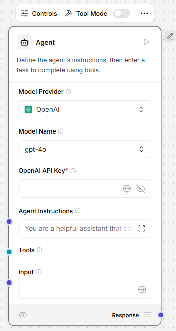
Each component includes a header menu that provides quick access to commonly used actions. Some key options include:
a. Code: Open and edit the component’s underlying Python code to modify advanced settings or custom logic.
b. Controls: Access all configurable parameters, including optional settings hidden by default.
c. Tool Mode: Enable this mode when integrating the component with an Agent component for specialized use cases.
For additional actions—such as duplicating or deleting a component, click Show More in the header menu.
Renaming a Component
To rename a component or update its description:
1. Click the component in the Workspace.
2. Select Edit from the header menu.
3. Update the name and/or description.
Tip: Component descriptions support Markdown syntax for better formatting.
Running a Single Component
You can execute an individual component independently to test its behavior.
a. Click Run Component on the selected node.
b. A Last Run value will confirm successful execution.
How It Works:
1. The component’s build_vertex function is invoked, using inputs provided through the UI (inputs_dict).
2. This returns a VertexBuildResult, which is passed to the build_and_run method.
3. Only the selected component runs—upstream dependencies are not executed.
This is different from running an entire flow, where execution proceeds through all dependencies in sequence.
Viewing Output and Logs
To inspect the results of a single component:
1. Select the component in the Workspace.
2. Click Inspect to view:
a. Output data
b. Execution logs
c. Runtime status
Freezing a Component
Important: Freezing a component will also freeze all its upstream components.
Use the Freeze option when the output from a component and its dependencies are stable and doesn’t need to be re-executed in future runs.
a. This prevents re-running the component and its inputs.
b. Instead, Robility Flow reuses the preserved output from the last successful run.
To Freeze:
1. Select the component in the Workspace.
2. Open the Show More menu in the header.
3. Click Freeze.
Component ports
Each component displays circular icons along its edges—these are ports used to pass data between components- .
a. Input Ports: Accept incoming data.
b. Output Ports: Send data to downstream components.
Data types are inferred based on the field or are color-coded. For example, a blue port on the System Message field represents message data.
When designing flows in Robility Flow, you connect output ports of one component to the input ports of another to enable data transfer. For a successful connection, the data types must match, which is visually indicated by port colors.
To understand the underlying structure of each data type, refer to the Robility Flow Data Types documentation.
Tips for Connecting Ports
a. Hover over a port to view detailed information about its expected input or output.
b. Click a port to automatically filter the Components menu and display only those with compatible connection types.
c. If two components use incompatible data types, insert a processing component such as Type Convert to transform the data as needed.
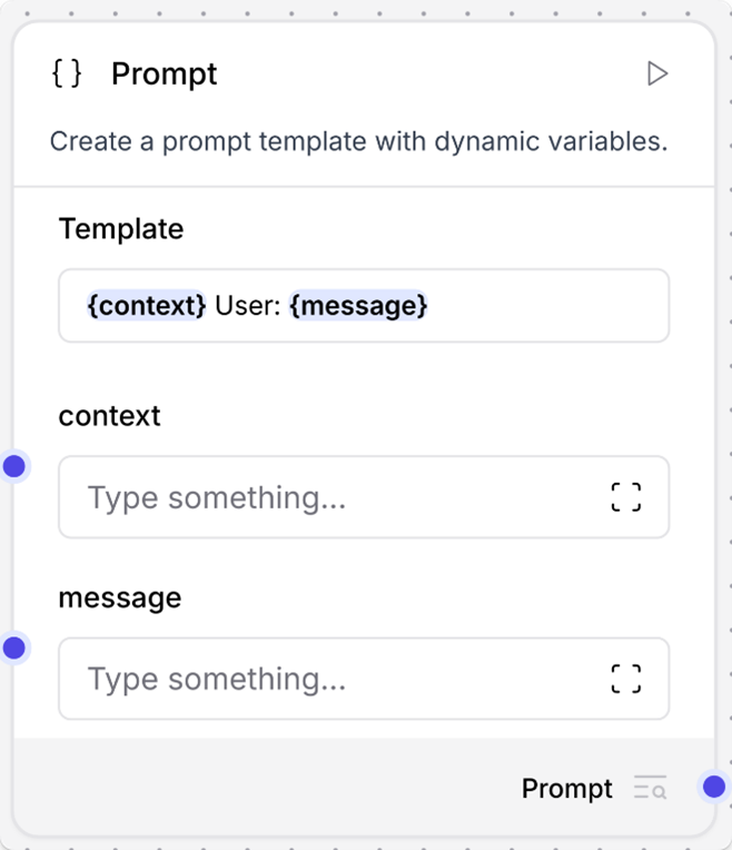
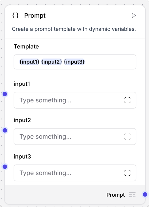
Dynamic Ports
Some components support dynamic ports that appear or disappear based on context. For instance:
a. The Prompt component dynamically creates new input ports when variables are detected within curly braces {} in the Template.
b. As soon as a new variable is referenced (e.g., {username}), a matching port is added to accept input for that placeholder.
This dynamic behavior allows for flexible, context-aware component configuration without requiring manual port setup.
Output Type Selection
Certain components in Robility Flow provide dropdown menus that allow you to choose the type of output to send to the next component in the flow.
Example: Language Model Component
This component offers multiple output options:
1. Model Response: Sends a standard message output, typically connected to another component expecting a Message input.
2. Language Model: Provides a raw LLM output that can be routed to components like Structured Output, enabling advanced reasoning or further processing.
How Output Selection Works in Code
The behavior of output options is controlled by the group_outputs parameter within the component’s code:
1. group_outputs=False (default):
All outputs are combined into a single dropdown menu, allowing only one output to be selected at a time.
2. group_outputs=True:
Outputs are displayed individually, enabling multiple outputs to be exposed and connected simultaneously.
Port colors
The color of a component’s port visually represents the type of data it sends or receives. For instance, a Message port indicates that it either accepts or emits data of type Message.
Below is a reference table mapping data types to their corresponding port colors:
| Data type | Port color |
|---|---|
| Data | Red |
| DataFrame | Pink |
| Embeddings | Emerald |
| LanguageModel | Fuchsia |
| Memory | Orange |
| Message | Indigo |
| Tool | Cyan |
| Unknown or multiple types | Gray |
Component code
You can edit components in the workspace and in code. When editing a flow, select a component, and then click Code to see and edit the component’s underlying Python code.
All components have underlying code that determines how you configure them and what actions they can perform. In the context of creating and running flows, component code does the following:
1. Determines what configuration options to show in the visual editor.
2. Validates inputs based on the component’s defined input types.
3. Processes data using the configured parameters, methods, and functions.
4. Passes results to the next component in the flow.
All components inherit from a base Component class that defines the component’s interface and behavior.
Each component’s code includes definitions for inputs and outputs, which are represented in the workspace as component ports. For example, the RecursiveCharacterTextSplitter has four inputs. Each input definition specifies the input type, such as IntInput, as well as the encoded name, display name, description, and other parameters for that specific input. These values determine the component settings, such as display names and tooltips in the visual editor.
inputs = [
IntInput(
name=”chunk_size”,
display_name=”Chunk Size”,
info=”The maximum length of each chunk.”,
value=1000,
),
IntInput(
name=”chunk_overlap”,
display_name=”Chunk Overlap”,
info=”The amount of overlap between chunks.”,
value=200,
),
DataInput(
name=”data_input”,
display_name=”Input”,
info=”The texts to split.”,
input_types=[“Document”, “Data”],
),
MessageTextInput(
name=”separators”,
display_name=”Separators”,
info=’The characters to split on.\nIf left empty defaults to [“\\n\\n”, “\\n”, ” “, “”].’,
is_list=True,
),
]
Additionally, components have methods or functions that handle their functionality. For example, the RecursiveCharacterTextSplitter has two methods:
def get_data_input(self) -> Any:
return self.data_input
def build_text_splitter(self) -> TextSplitter:
if not self.separators:
separators: list[str] | None = None
else:
# check if the separators list has escaped characters
# if there are escaped characters, unescape them
separators = [unescape_string(x) for x in self.separators]
return RecursiveCharacterTextSplitter(
separators=separators,
chunk_size=self.chunk_size,
chunk_overlap=self.chunk_overlap,
)
The get_data_input method retrieves the text to be split from the component’s input, which makes the data available to the class. The build_text_splitter method creates a RecursiveCharacterTextSplitter object by calling its parent class’s build method. Then, the text is split with the created splitter and passed to the next component.
Component versions
Versioning Overview
Robility Flow maintains an internal database to track component versions and states. When you add a component to a flow, a detached copy of that component is created based on the database version at that time.
This detached copy:
a. Is isolated from future updates in the Robility Flow database.
b. Retains its version and configuration as it was initially added.
c. Does not automatically update, even if newer versions become available after a platform upgrade.
Example:
If a component is at version 1.0 when added to a flow, it remains at 1.0 until explicitly updated—even if a newer version (e.g., 1.2) is later introduced.
Updating Components
Robility Flow notifies you when a component in your flow is out of sync with its latest available version:
a. Update ready: Safe to update. No breaking changes are expected.
b. Update available: The update may include breaking changes, such as modifications to input/output structure. These updates may require reconfiguration or reconnection of component ports.
Breaking changes may disconnect components or affect flow execution. Review changes before applying.
How to Update Components
You can update components using two methods:
1. Single Component Update
Click Update on a specific component when no breaking changes are present.
2. Review and Bulk Update
a. Click Review to see all components with available updates.
b. Optionally enable Create backup flow before updating to generate a snapshot with the suffix (backup) in the same project folder.
c. Select specific components to update or update all in one go by clicking Update Components.
Components will be updated to the latest version compatible with your current Robility Flow installation.
Grouping Components
Grouping allows you to combine multiple components into a single, reusable unit. This is ideal for organizing complex flows and encapsulating logic—for example, bundling a RAG Agent with its Vector Database.
To Group Components:
1. Hold Ctrl (Windows) or Cmd (Mac) and click each component you want to group.
2. Click Group to merge them into a single component.
Grouped components:
a. Share a unified configuration, name, and codebase.
b. Can be reused, managed, and edited as one logical block.
To Ungroup Components:
1. Click the grouped component in the Workspace.
2. Open the header menu.
3. Select Show More → Ungroup.
To Reuse Grouped Components Across Flows:
1. Select the grouped component in the Workspace.
2. Open the header menu.
3. Click Show More → Save to add it to your Components menu for reuse in other flows.
